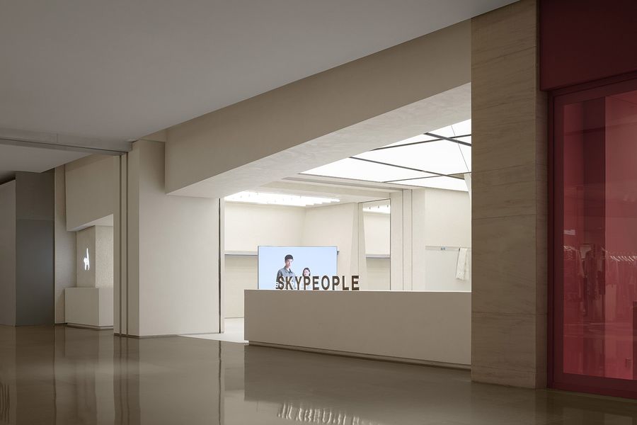
致力于赋能新生代职场人群,成衣品牌 SKYPEOPLE北京店选址三里屯太古里北区。本案是针对零售空间“品牌表达力”的一次探索式回应,设计立足城市肌理、建筑肌理和服装肌理的相互塑造,依据产品“简便、实用、高效、得体”等特点及其背后设计理念展开。
Dedicated to empowering young professionals, ready-to-wear brand SKYPEOPLE has opened a new store in Taikoo Li Sanlitun, Beijing. This case is an exploratory response to the subject of incorporating brand identities in retail spaces. The design embodies such notable features of the brand’s products as simplicity, practicality, effi-ciency, and decency as well as their underlying design concepts while acknowledging the mutual influence of urban, architectural, and fashion textures.
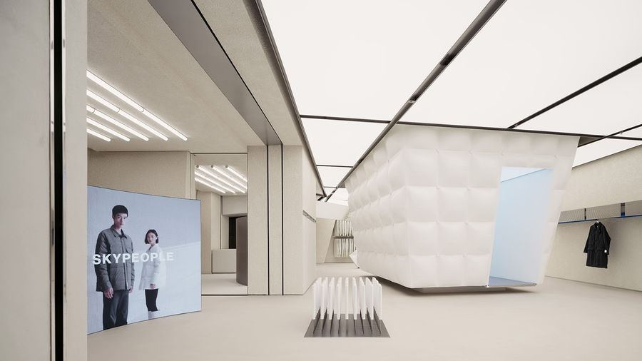
▼项目概览,Overall view © 言隅建筑空间摄影
基于对品牌的深入理解,我们再度思考服装于各类城市应用场景中所扮演的角色以及服装本身构成,从布局、陈设、软装、色彩策略、灯光设计等方面入手,用空间诠释品牌对产品城市性能和人文气质的执着。正如好的服装设计能让穿着变得省力、不过时,我们尝试打造一个松弛而能激发持久审美力的商业空间。
Based on an in-depth study of the brand, we reconsidered the roles played by outfits in different urban settings and the composition of clothes. Starting with the store’s layout, furnishing, soft decoration, colouring strategy, and lighting design, we let the space itself speak for the brand’s pursuit of urban performance and humanistic temperament. Just as good fashion design makes wearing effortless and timeless, we try to create an elegant commercial space that gives lasting aesthetic pleasure.
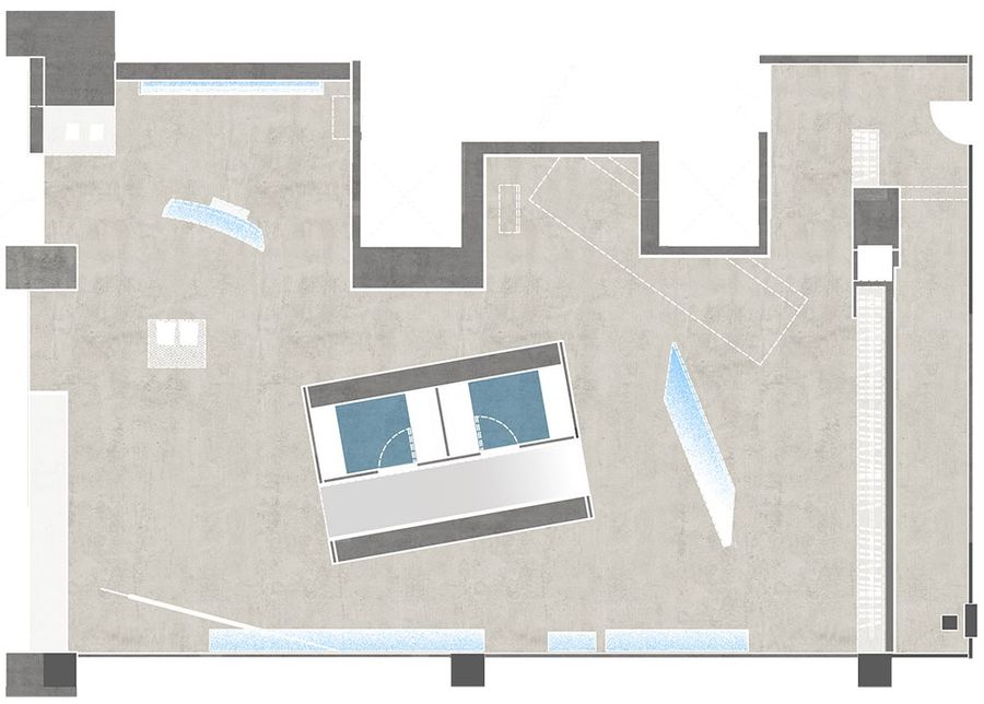
▼平面图,Floor plan © F.O.G.建筑事务所
1. 拼贴城市
Collage City
服装的功能从“遮衣蔽体”、“礼制维护”、“身份象征”演变至今已涵盖实用价值、文化价值和个人审美与立场表达等多个维度,服装的更新迭代因此可以映照一座城市的精神内核乃至生长轨迹,无论是城市场景、需求还是生活方式的多元化发展,都直接或间接影响着人们对服装的看法和预期。“城市”于是成为设计的首个立足点。
From protection and adornment to maintenance of etiquette, representation of status, and expression of individ-uality, the functions of clothes have expanded from predominantly practical into cultural, aesthetic, and various other dimensions. The evolution of fashion can therefore reflect a city’s core spirit and path of development. The diversification of urban scenes, demands, and lifestyles or any major changes happening in the city all affect people’s perceptions of and anticipations toward fashion. The concept of city has thus become the first foothold of our design.
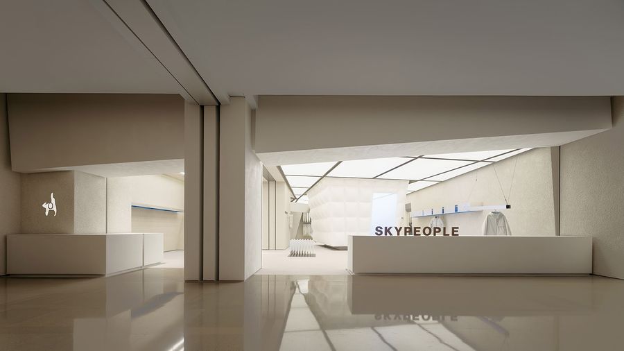
▼店铺正面,Storefront © 言隅建筑空间摄影
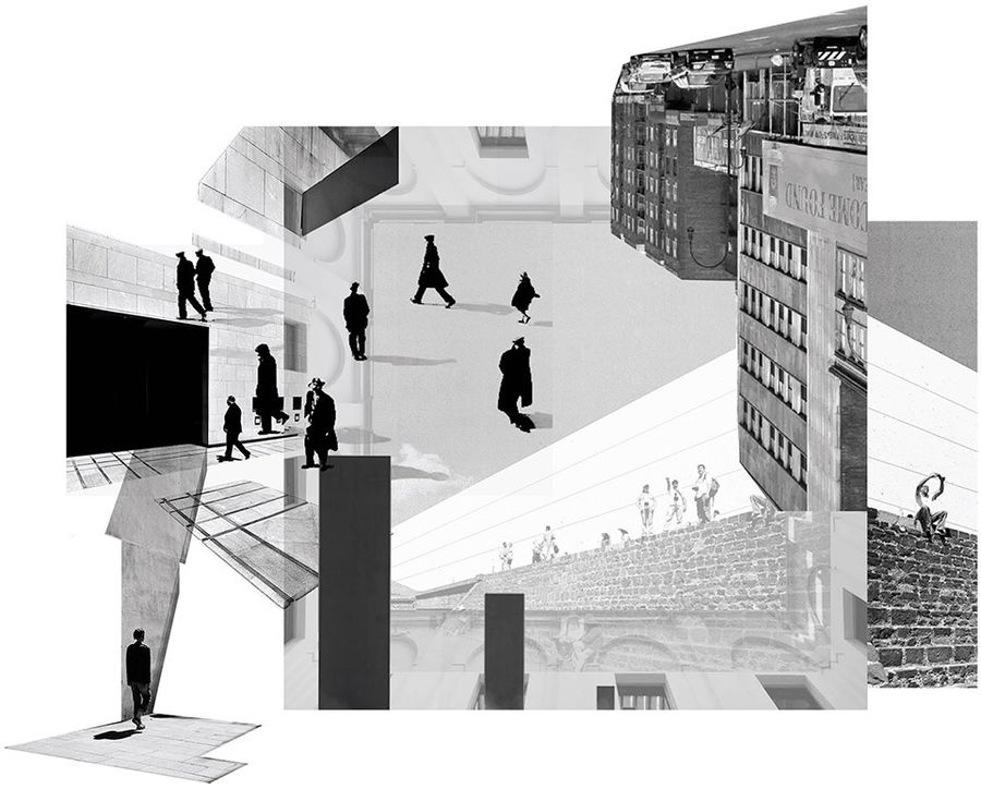
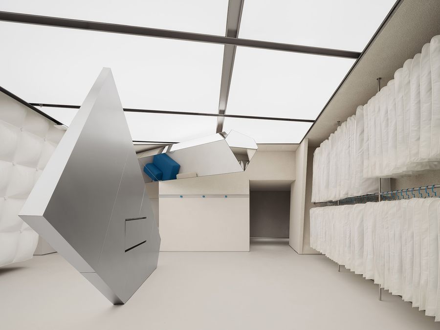
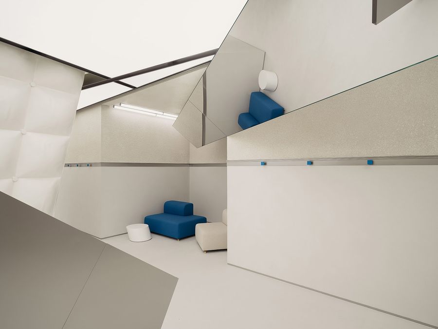
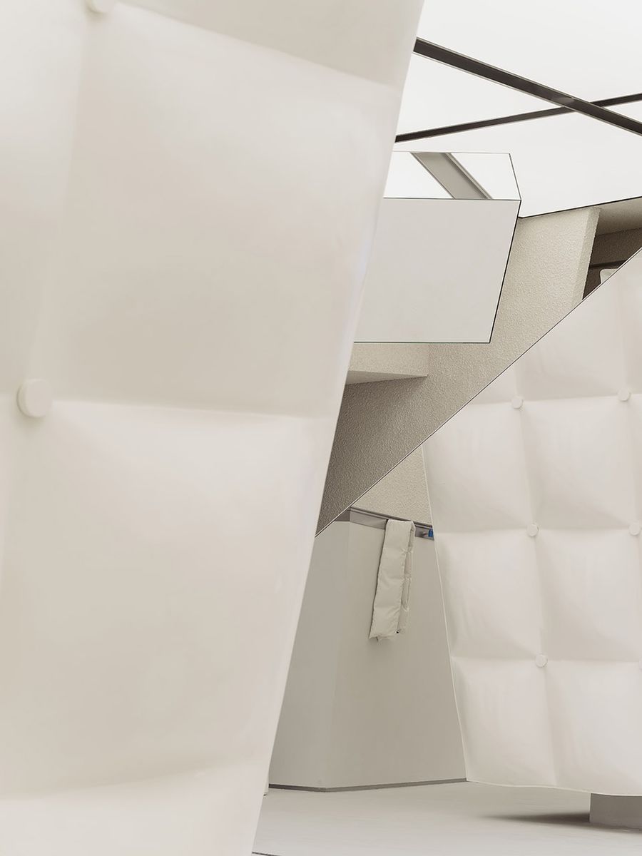
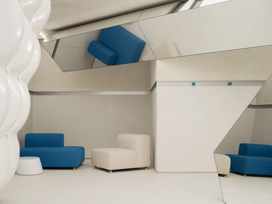
我们设想将人群在不同视角下所观察到的城市“切片”融合在同一空间内,具体手法是建立不规则形状、“随机”分布的镜面几何体结构,利用反射原理和遮挡物之间的错位,为空间嵌入更丰富的透视关系,塑造一种将城市切割后重新拼贴起来的视觉效果。
▼“拼贴城市”灵感汇集,Inspirations for “Collage City” © F.O.G.建筑事务所
We pictured mixing the different “slices” of a city observed by different crowds from their perspectives in one room. More specifically, we installed irregularly shaped, casually staggered bodies of mirrors throughout the store. A more labyrinthine spatial relationship is resulted from the collective effect of the reflection of and the obstruction of view by these structures, thereby embedding more dynamic perspectives into the space. Ulti-mately, we want to achieve a visual effect of a city being cut into pieces and reconfigured back together.
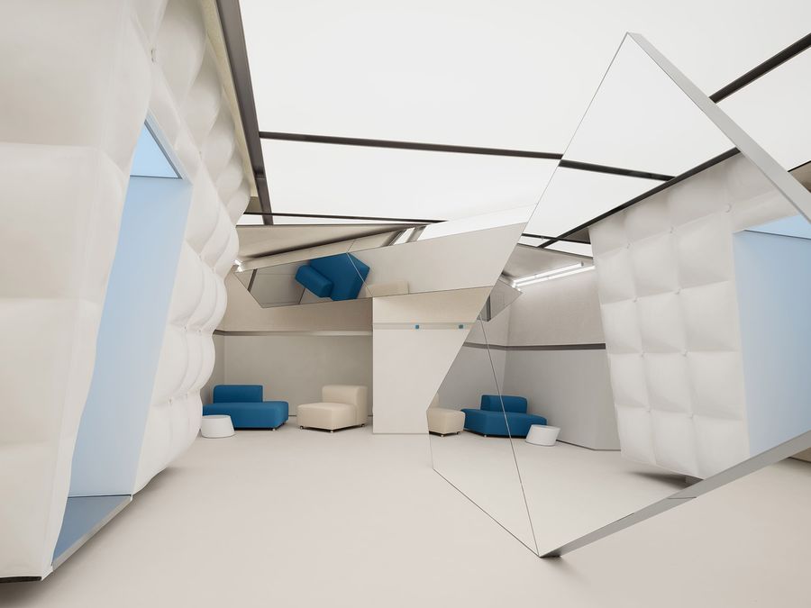
▼不规则的镜面几何体结构“随机”分布于空间,Irregularly shaped, casually staggered bodies of mirrors are installed throughout the store © 言隅建筑空间摄影
分布在不同高度的“镜面碎片”互相咬合,以难以预料的方式扭转人们视线,同时让观察视角更加多元动态,空间随之拥有的不同“表情”叠加碰撞,令人体会到行走在错综复杂的城市网络中。
The “mirror fragments” distributed at different heights turn people’s sights in unpredictable ways, providing them with more perspectives of observing the space. The space itself is also given different expressions that overlay while clashing with each other. Passing through them is like walking in an intricate city web.
▼镜面碎片,Mirror fragments © 言隅建筑空间摄影
围绕“视角”生成的一系列设计也来自SKYPEOPLE对职场文化的理解。正如以不同视角观察同一空间或城市会获得新的印象和感知,职场中,切换视角时常会帮助我们发现灵感和更优解。
Such design actions centred on “perspective” have also come from SKYPEOPLE’s take on workplace culture. New observation perspectives give us new impressions and perceptions of the city. Likewise, in the workplace, switching perspectives often helps us find inspirations and better solutions.
▼透视关系,Perspectives © 言隅建筑空间摄影
2. 悬浮走廊
Floating Corridor
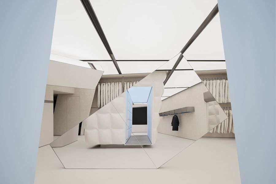
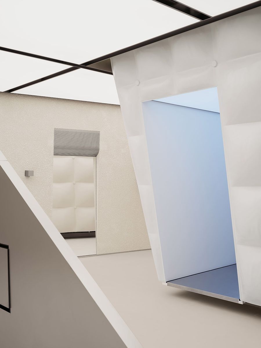
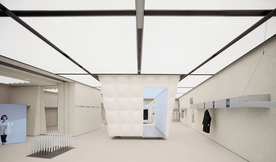
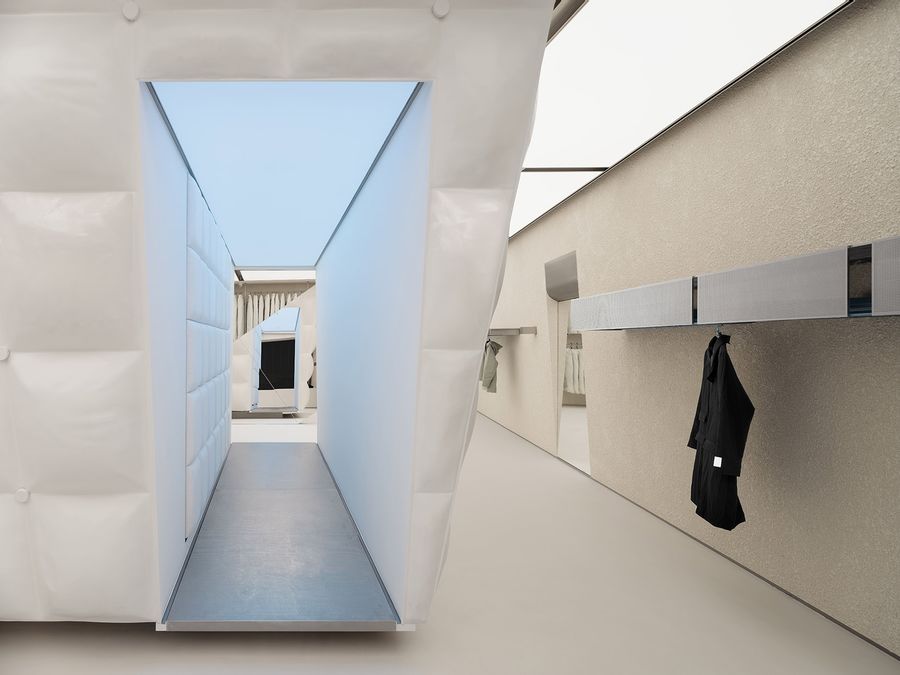
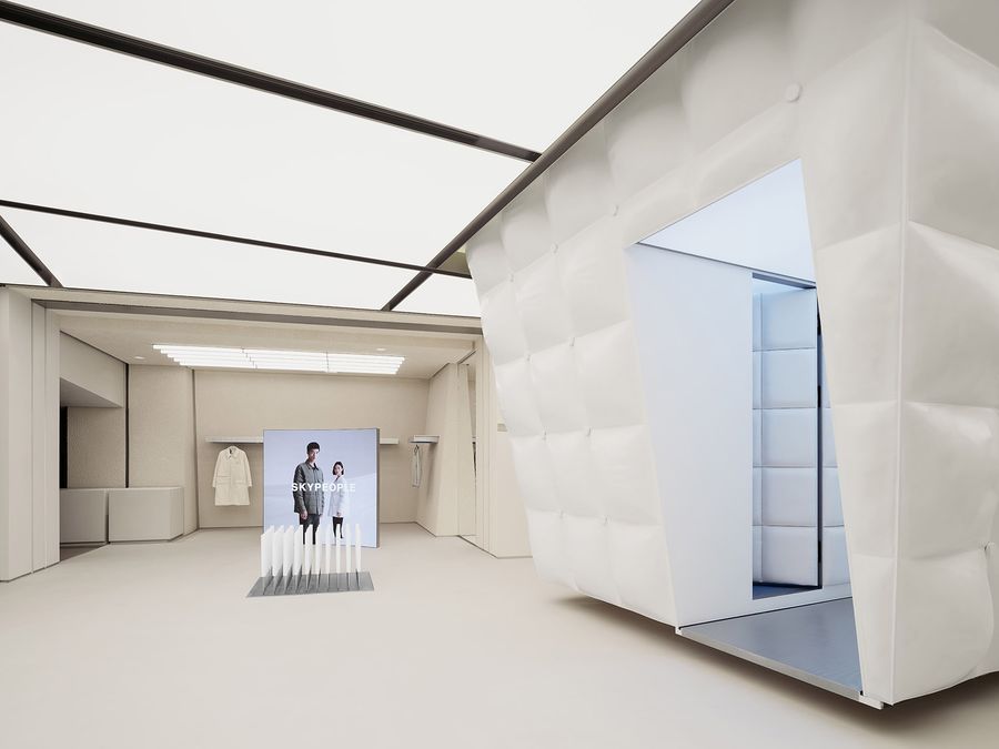
悬挂在空间中央的倒梯形体结构内部作为试衣间使用,顶部与天花相接,底部与地面留有20cm缝隙。打破传统服装门店布局策略,我们将试衣间从场地边缘挪至正中,无论是视觉还是主题层面,这一结构都具有决定性意义。
The fitting rooms are situated inside the inverted trapezoid hanging at the centre of the space. Its top adheres to the ceiling, while the bottom is 20 cm elevated from the floor. Contrary to the traditional layout of a clothes shop, we demarginalized the fitting rooms to give it both visual and thematic weights.
▼试衣间,Fitting rooms © 言隅建筑空间摄影
▼试衣间近景,Close-up view © 言隅建筑空间摄影
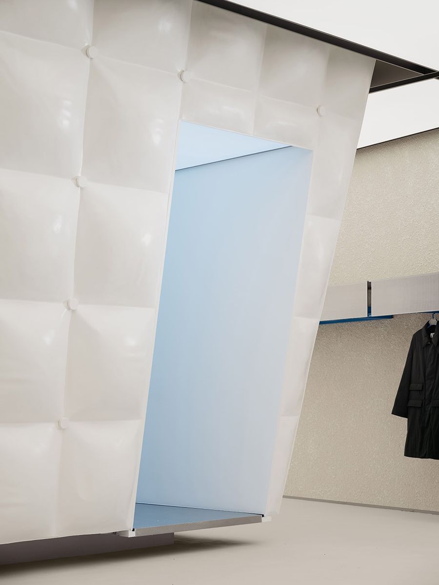
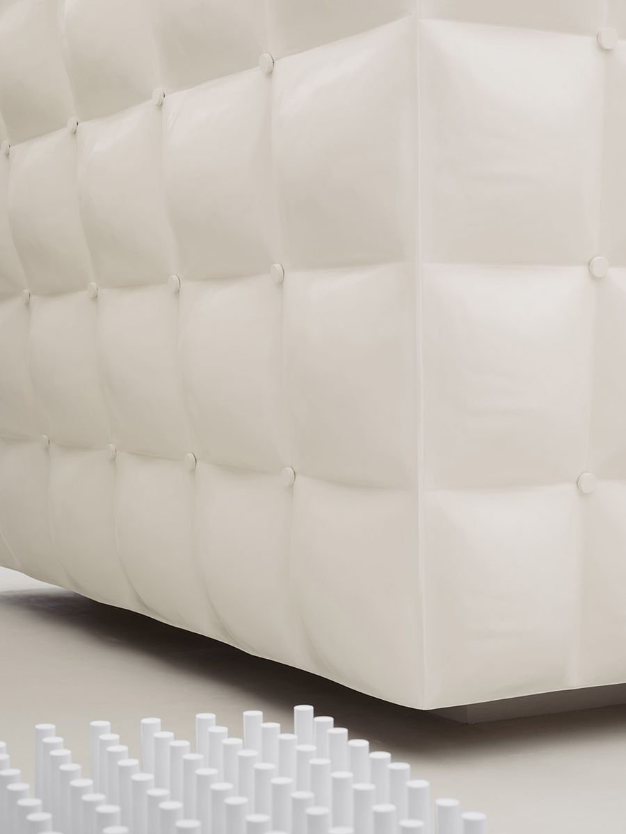
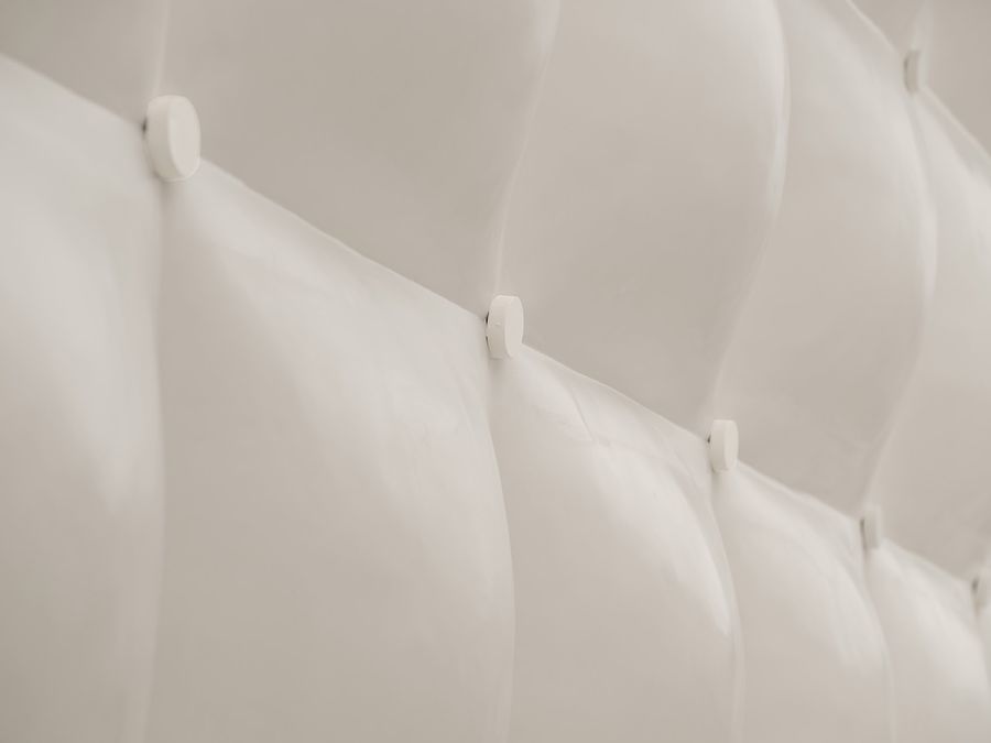
利用材料可塑性并仿照羽绒服表面的填充缝合轮廓,我们为结构打造了视觉上柔软蓬松、应用中耐久易清洁的外部肌理,呼应品牌对服装面料质地和实用性的双重考量。结合空间中的“镜面碎片”,这一结构也可以被视作摩天大楼的抽象变体,将城市中拔地而起的冰冷的高大建筑柔化成“从天而降”的轻盈温暖的漂浮形象。
We modelled the structure’s exterior after the typical filling-stitching contour of the surface of down jackets. By virtue of the plasticity of the material, we made its texture look soft and cushiony, which is simultaneously dura-ble and easy to clean in application, echoing the brand’s mindfulness of both fabric texture and practicality. Put in the same context as the mirror fragments are, this structure may also be seen as an abstraction of sky-scrapers. The aloof image of these lofty buildings shooting from the ground is softened into an airy, approacha-ble existence “falling from the sky.”
▼柔软蓬松的外部肌理,The soft and cushiony exterior texture © 言隅建筑空间摄影
▼细节,Detailed view © 言隅建筑空间摄影
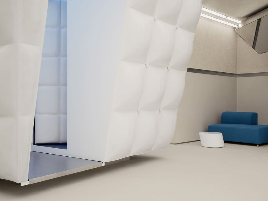
令人联想到降落在钢筋水泥森林中的“天外来物”,作为空间的视觉焦点,结构自身具有一种稳重冷静的气场,正切合产品“低噪响”的特征,另一层面,象征了城市里那些允许人们藏匿和安置情绪的私密环境。
The structure reminds us of a foreign object landing in a concrete jungle. As the visual centre of gravity, it has a calm, steady aura, which is in line with the products’ “low noise” feature. On a symbolic level, it can be seen as a variation of any private environment in the city where people feel safe putting down their emotions.
▼不同角度,Views from different angles © 言隅建筑空间摄影
3. 冬日公园
Winter Playground
城市空间是场所和事件经纬交织的产物,以公园为例,这里活动的发生、人群的交汇孕育住民心中的美好回忆,并赋予场所本身生命力;公园继而在改善生态、美化景观、提升住民生活质量等方面发挥作用,形成促进城市正向消长变化的良性循环。我们因此将“冬日公园”融入设定,在室内营造与“阳光”、“冰雪”、“公园”相关的场景意象,极度克制的设计语汇仍为空间的休闲功能和趣味性留有余地。
Urban spaces are the products of the interlacing of places and events. Take parks as an example, this type of places are vitalized by the occurrence of activities and the convergence of people, all of which eventually be-come the residents’ cherished memories. The parks then play a role in improving ecology, beautifying landscape, and enhancing the residents’ quality of life, thereby setting a virtuous cycle in motion to promote positive changes in the city. With this realization, we incorporated “winter playground” as part of the store’s identity by constructing imageries related to “sunshine,” “ice and snow,” and “parks.” The highly restrained design ap-proach still leaves room for recreational functions and a playful subtone.
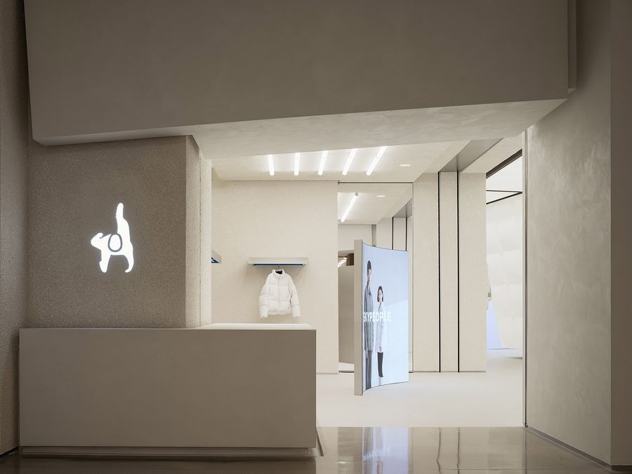
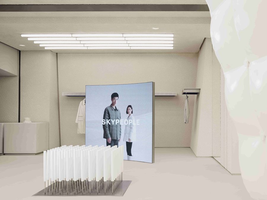
▼入口装置,Front installation © 言隅建筑空间摄影
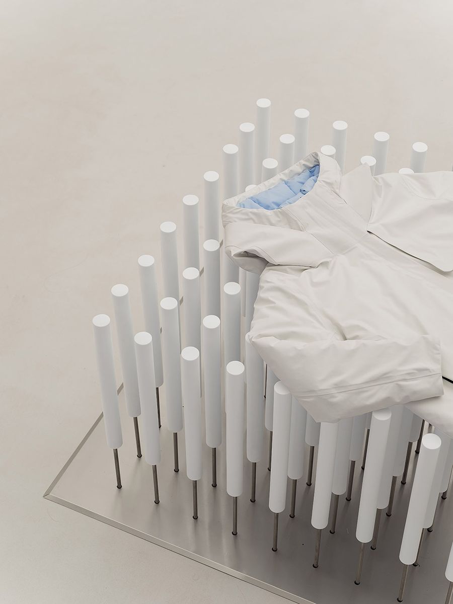
“设计是不断简化的过程”,这一理念启发我们在塑造冬日公园意象时采取相对抽象的设计手法。例如,入口处,90根实心泡沫和不锈钢制成的圆柱阵列装置将白雪覆盖的树木提炼为几何、金属元素,模拟“雪后树林”的形态。和直接使用植物造景相比,这种表达方式不会干扰空间基调,只在因人而异的联想中获得具体形象。
“Design is a process of constantly simplifying.” This concept inspired us to adopt relatively abstract design techniques as we worked toward the imagery of winter playground. Take the front installation as an example, a matrix of 90 columns made of solid foam and stainless steel simulates a forest covered in snow. The image of snow-covered trees is rendered into a fusion of geometric and metallic elements. Compared to using real plants, this method of expression interferes less with the general vibe of the store and is only given definite forms in viewers’ imaginations, which vary from person to person.
▼装置细节,Detailed view of the installation © 言隅建筑空间摄影
沙发造型仿照公园长椅,而改用更舒适的面料。
The couches are shaped like park benches while using more skin-friendly fabrics.
▼休息区,Lounge © 言隅建筑空间摄影
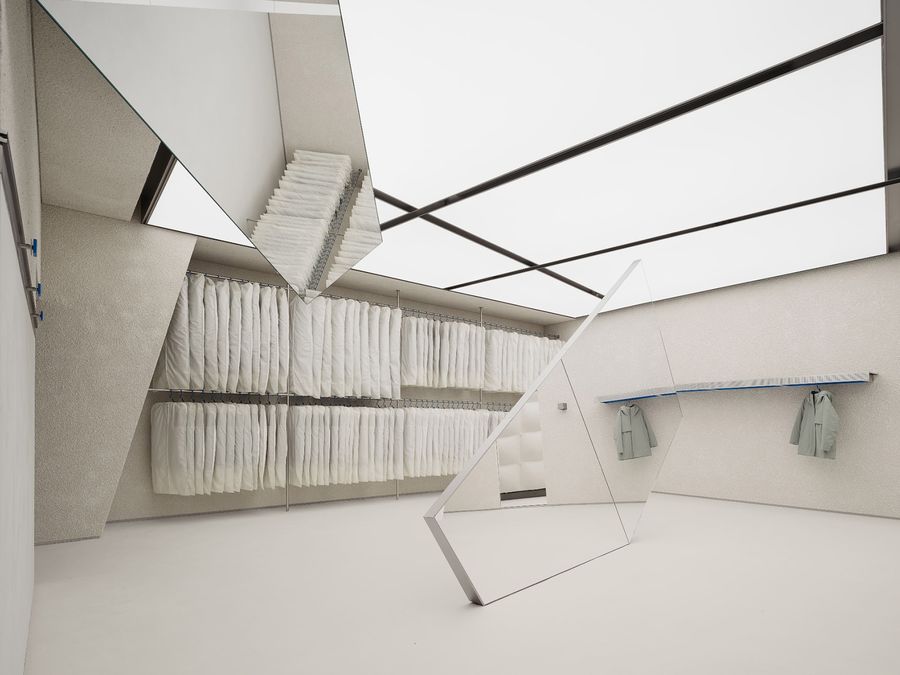
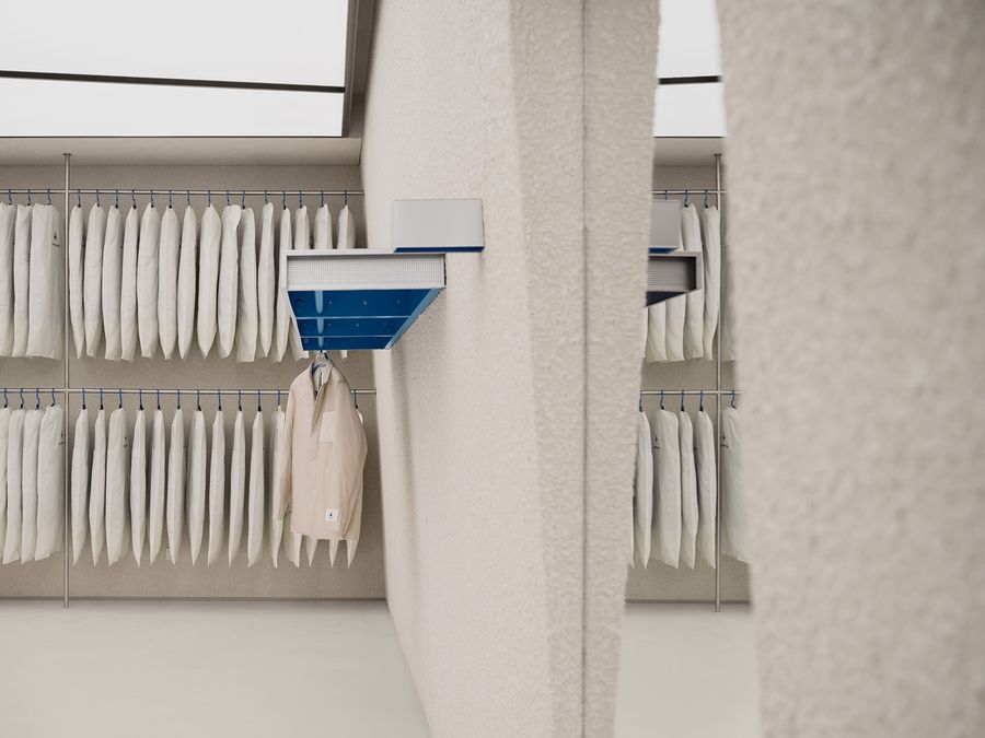
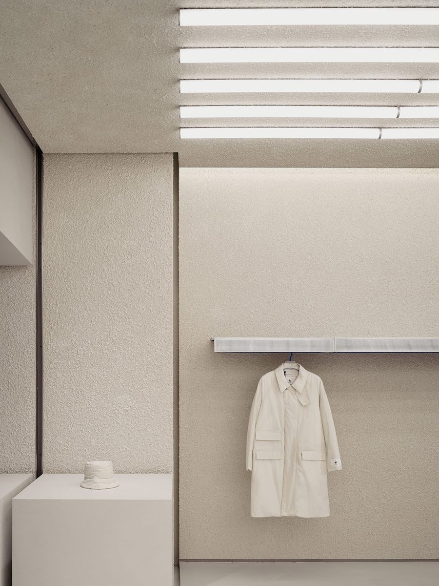
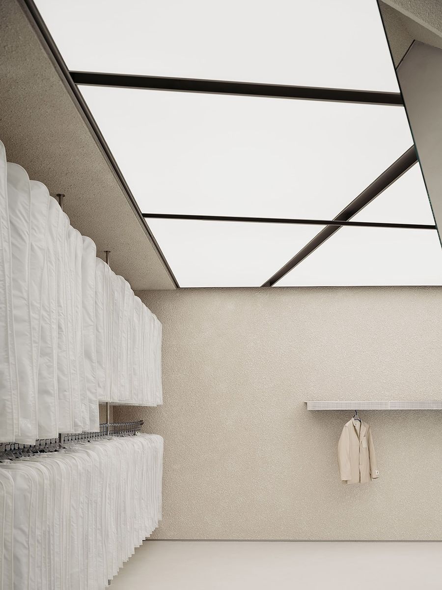
回廊式浏览动线环绕试衣间展开,营造一种“游园”体验;形式不一的金属质展陈道具以空间利用最大化和轻盈美观为原则,或是嵌入墙体或是用绳索悬吊在天花板上;店内并未设有传统仓库和收银台,而是采用更加透明的仓储式展陈,将库存收纳在防尘袋内于店铺后端展出,缓解库存压力、节省空间的同时,让选购过程更加自主、快捷、流畅而具有互动乐趣。
The cloister-style browsing path wraps around the fitting rooms, making customers feel like touring a garden. Different forms of metallic display props are set in place in order to maximize space utility while maintaining a casual, decent appearance. They are either embedded in the walls or suspended by ropes from the ceiling. There is no traditional storage room or cash register in the store; instead, we adopted the more transparent warehouse-style display method. The inventory items are stored in dust bags and displayed on racks at the back of the store. This method has the advantages of relieving storage pressure, saving space, and expediating the shopping process, making it more smooth, self-directed, and engaging for the customers.
▼仓储式展陈,Warehouse-style product display © 言隅建筑空间摄影
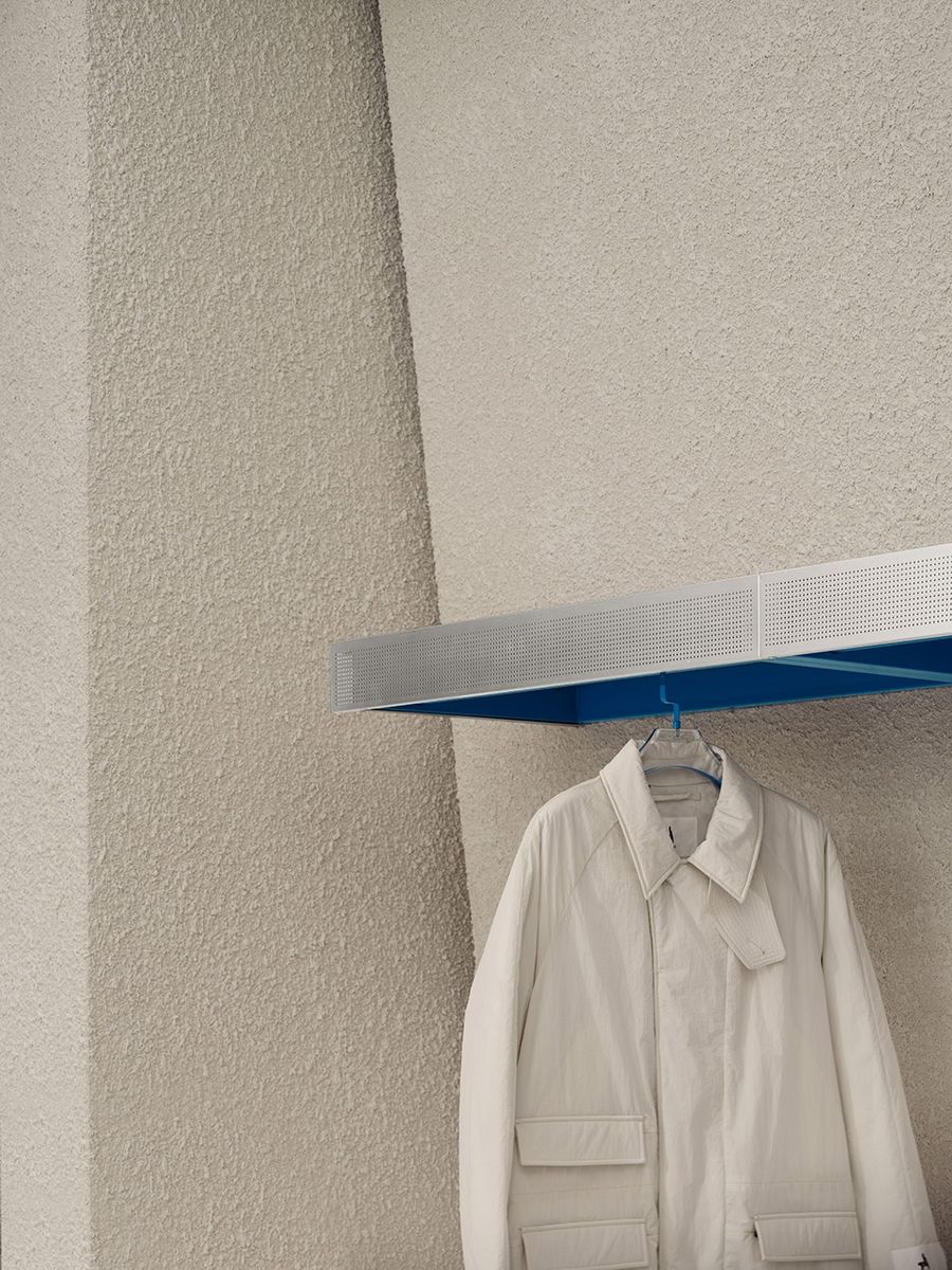
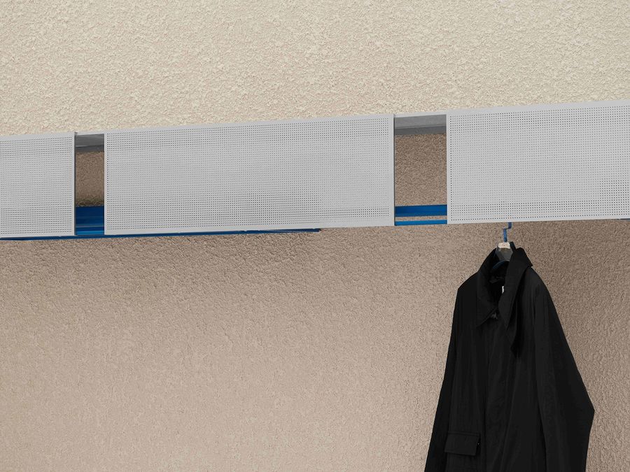
▼嵌入展陈墙体的金属衣架,Metal hangers fixed on the display walls © 言隅建筑空间摄影
▼衣架细节,Detailed view © 言隅建筑空间摄影
多功能挂钩:细部色彩点缀挑染出几分俏皮的空间氛围,灵感来自SKYPEOPLE羽绒服领口处标志性的跳色设计。
Multipurpose Hanger: This slight colorful embellishment brings out a bit of a playful vibe. It is inspired by SKYPEOPLE’s iconic collar design distinguished by a shock of color (normally blue) at the neckline.
▼多功能挂钩,Multipurpose Hanger © 言隅建筑空间摄影
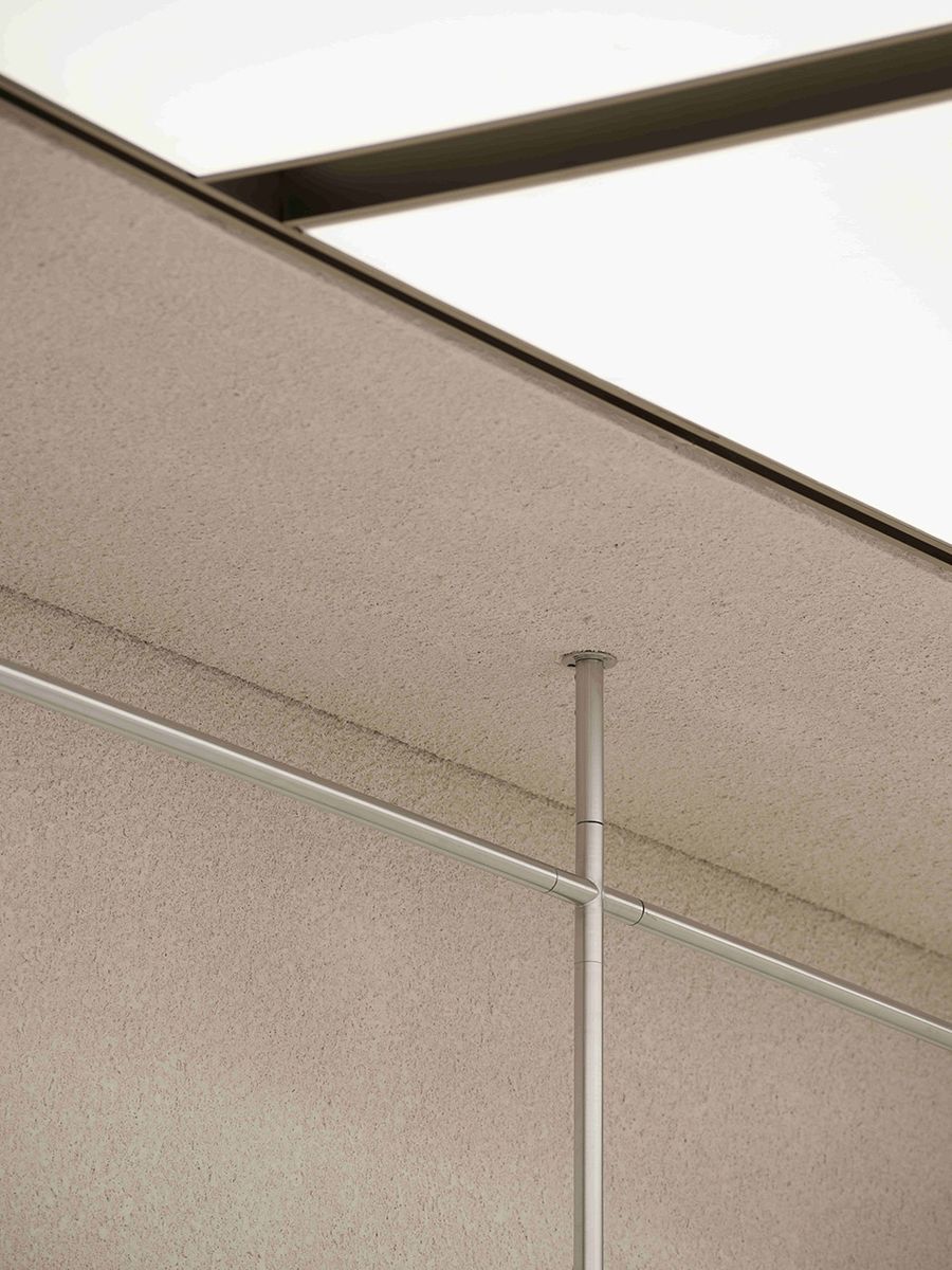
▼不锈钢衣杆造型酷似单杠 © 言隅建筑空间摄影
Stainless steel display rack shaped like a monkey bar
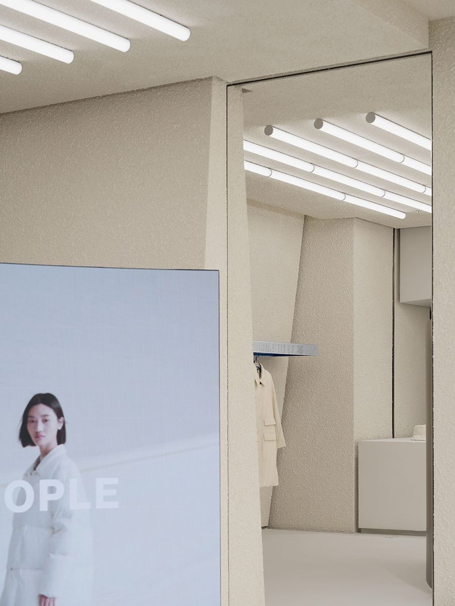
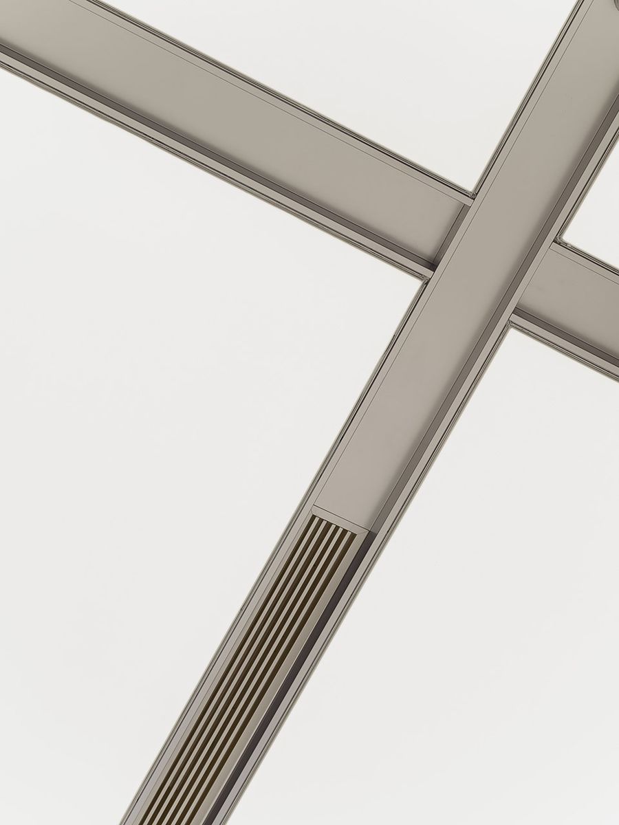
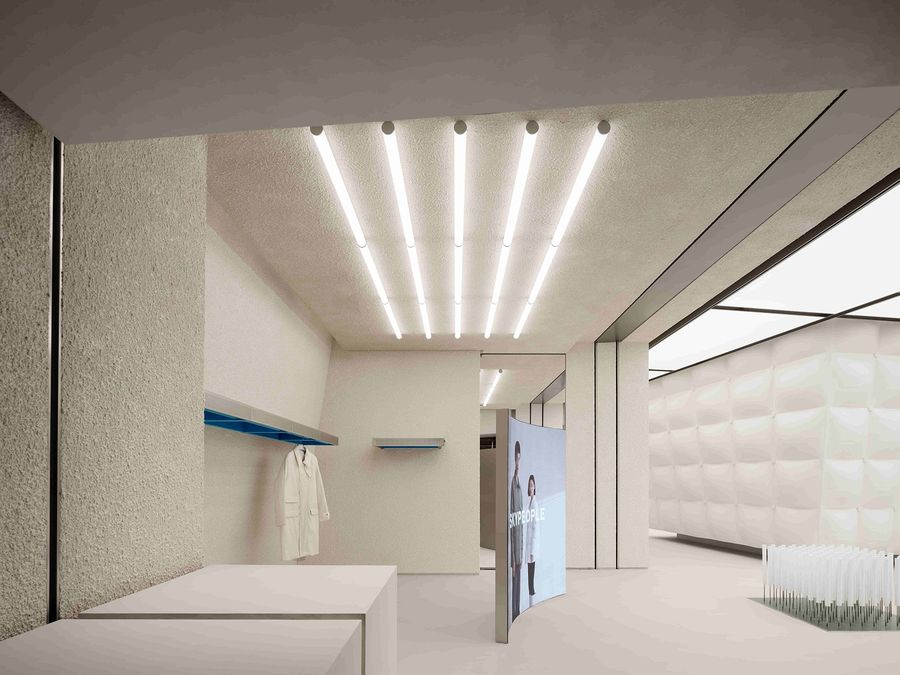
为避免光斑破坏空间立面的平整性和粗粝感,我们大面积使用软膜灯光,根据场地线条特征排布灯光分割方式,并穿插使用灯管,均衡空间整体灯光照度。这种灯光策略让整个场地看似被日光漂白过的雪地,通透明亮而趋近隐形。
To avoid flares, which will interrupt the flatness and roughness of the façade, we used a large number of soft film light boxes and pieced them together according to the geometric characteristics of the site. Meanwhile, some light tubes are interspersed to balance the overall lighting intensity. This strategy makes the entire site look like a snowfield bleached by sunlight, appearing bright, clear, and approaching invisible.
▼软膜灯光,Soft film light boxes © 言隅建筑空间摄影
▼灯管,Light tubes © 言隅建筑空间摄影
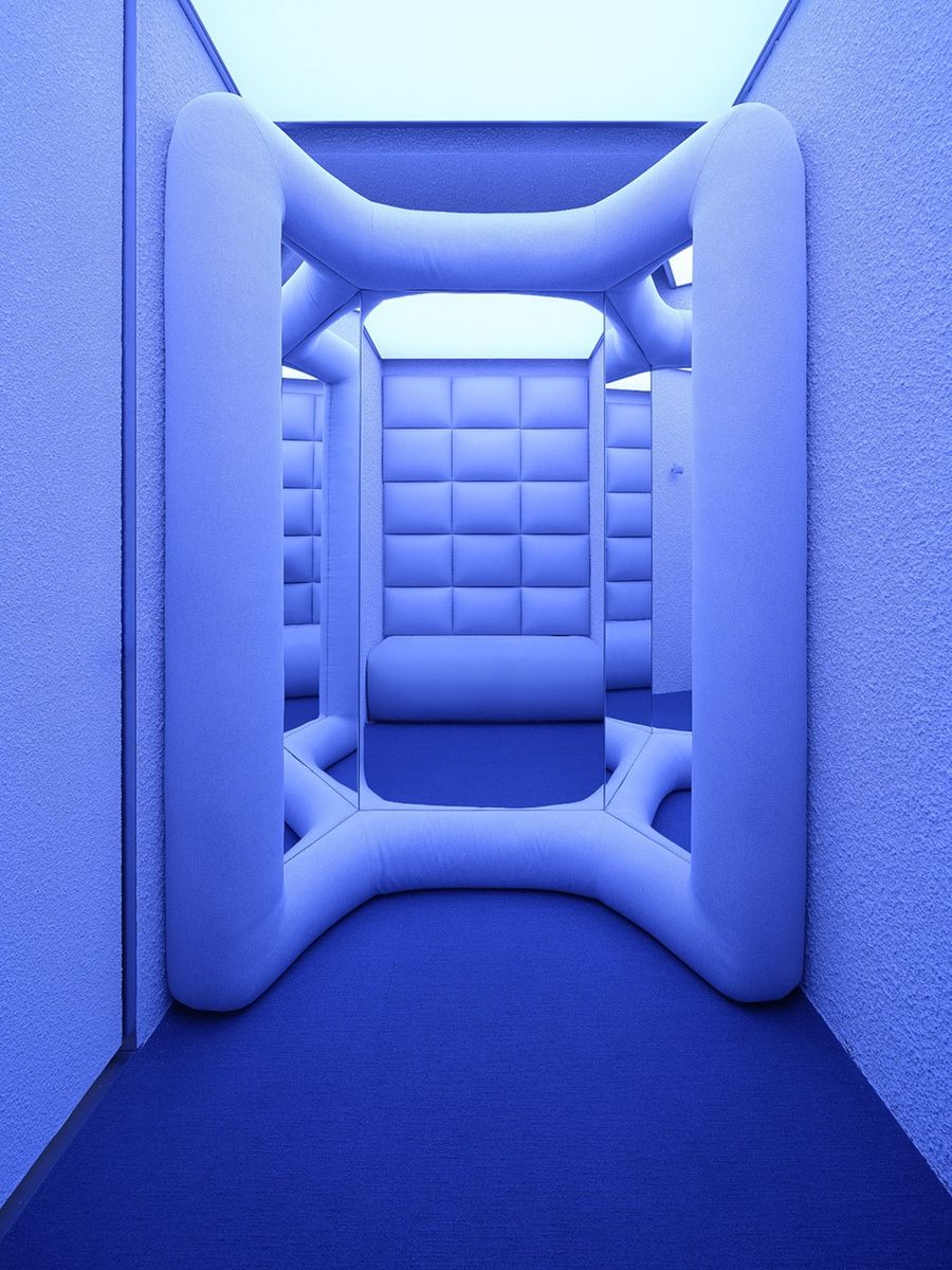
试衣间内部,蓝紫渐变灯光反衬出羽绒的温度,雾化的色彩从走廊入口漫延而出,在一片亮白中氤氲开来,将空间逐渐激活的同时营造出一种与“太空”、“极地”相关的科技感氛围。
In the fitting rooms, gradient blue and purple light sets off the warm-keeping feature of down. The nebulized pigments diffuse like a colourful fog from the floating corridor into an expanse of bright whiteness. While they gradually wake up the space, a futuristic vibe associated with outer space or polar regions is sparked off.
▼试衣间灯光,Lighting in the fitting rooms © 言隅建筑空间摄影
实际上,我们有意让产品的陈列方式和品牌色的局部使用以相对次要而自然的方式浮出视线,在不破坏空间完整度的情况下击中视觉记忆点。色彩对比加上阴影的缺席,让物体看似呈失重状“漂浮”其中。
In fact, we purposely displayed the products and applied brand colours in ways such that they would surface from people’s views in a relatively subtle, peripheral fashion that is memorable without undermining the visual integrity of the space. The contrast of colours and the absence of shadow make objects appear as if floating in zero gravity.
▼试衣间内部,Fitting room interior view © 言隅建筑空间摄影
人们倾向于以自身尺度为基础建立对周遭的感知,我们所认识的物理世界是从个人或群体视角观察得到的结果,是局限的、畸变的、千人千面的。对于这一宏大议题,“拼贴城市”仅作为初步尝试、一份“潦草”答卷——“透过多种视角捕获的城市画片漂浮于寒冷地带,拼贴成一座光怪陆离的新世界”——我们希望以此激发人们探索多元视角的愿望,为观察城市、栖居城市、想象城市提供别外可能。
People are used to observing their surroundings from their own vantage points based on their own systems of measurement. Our perceptions of the physical world are therefore inevitably fragmented, distorted, and variegat-ed. In response to this grand subject, “Collage City” is only a preliminary attempt – a rough draft, so to speak. “Snapshots of the city captured through mixed perspectives floating above the snowfield, collaged into a strange new world” – through this, we hope to stimulate people’s interest in exploring different perspectives and provide alternative ways of observing, inhabiting, and imagining cities.
▼店铺外观,Storefront © 言隅建筑空间摄影
项目名称:SKYPEOPLE北京概念店
项目位置:北京
项目面积:220平方米
项目状态:建成
设计时间:2022.5
完工时间:2022.10
设计公司:F.O.G.建筑事务所
设计团队:邹德静,李诗楠,蒋璐,陈寒熙,黄莺子,侯绍凯,詹迪,郑宇
灯光设计:立本社 张旭
结构顾问:陶辛未
空间摄影:言隅建筑空间摄影
撰稿:白勺
Project name:SKYPEOPLE Beijing Concept Store
Project location:Beijing, China
Area:220 m2
Status: Built
Design time:2022.5
Complete time:2022.10
Design firm:F.O.G. Architecture
Design Team:Zou Dejing, Li Shinan, Jiang Lu, Chen Hanxi, Huang Yingzi, Hou Shaokai, Zhan Di, Zheng Yu
Lighting Design: Zhang Xu (LB Design)
Structure Consultant: Tao Xinwei
Photography: InSpace Architecture Photography
Article: Baishao
更多相关内容推荐









评论(0)